

C O M M U N I C A T I N G I N S I G H T S L I K E A U X D E S I G N E R
How I turned research and experiment updates into something people actually read.
Team Members:
Lead Designer: Me
tl;dr
As GameChanger grew, it became harder to get coworkers to engage with research and experiment updates. I created a repeatable, visual format to make key insights skimmable, engaging, and easy to act on. These one-pagers helped drive alignment, speed up decision-making, and became the go-to way to share progress across teams.
Diagnosing The Problem
As our company scaled, our communication got noisier. Long Slack updates were ignored. Verbose Notion docs gathered dust. Critical insights (whether from user interviews or live A/B tests) were getting lost in the shuffle.
The real challenge wasn’t the quality of the work. It was attention. My coworkers were busy, juggling competing priorities, and I was asking too much of them to absorb key findings buried in paragraphs of text.
I needed a new format. One that respected their time, made insights feel worth reading, and worked just as well for research as it did for experiments.

The Solution
I treated internal communication like a design problem. My goal was to create a visual system that turned user insights and experiments into stories you wanted to read—skimmable, engaging, and reusable.
The result was a set of highly visual recaps built around the same principles we apply to good UX:
Clarity first
Prioritize hierarchy
Lead with what matters
Use data and quotes to humanize the insight
Make the next step obvious
These weren’t decks. They weren’t memos. They were bold, digestible one-pagers designed to live in Slack, Notion, or anywhere attention was scarce.
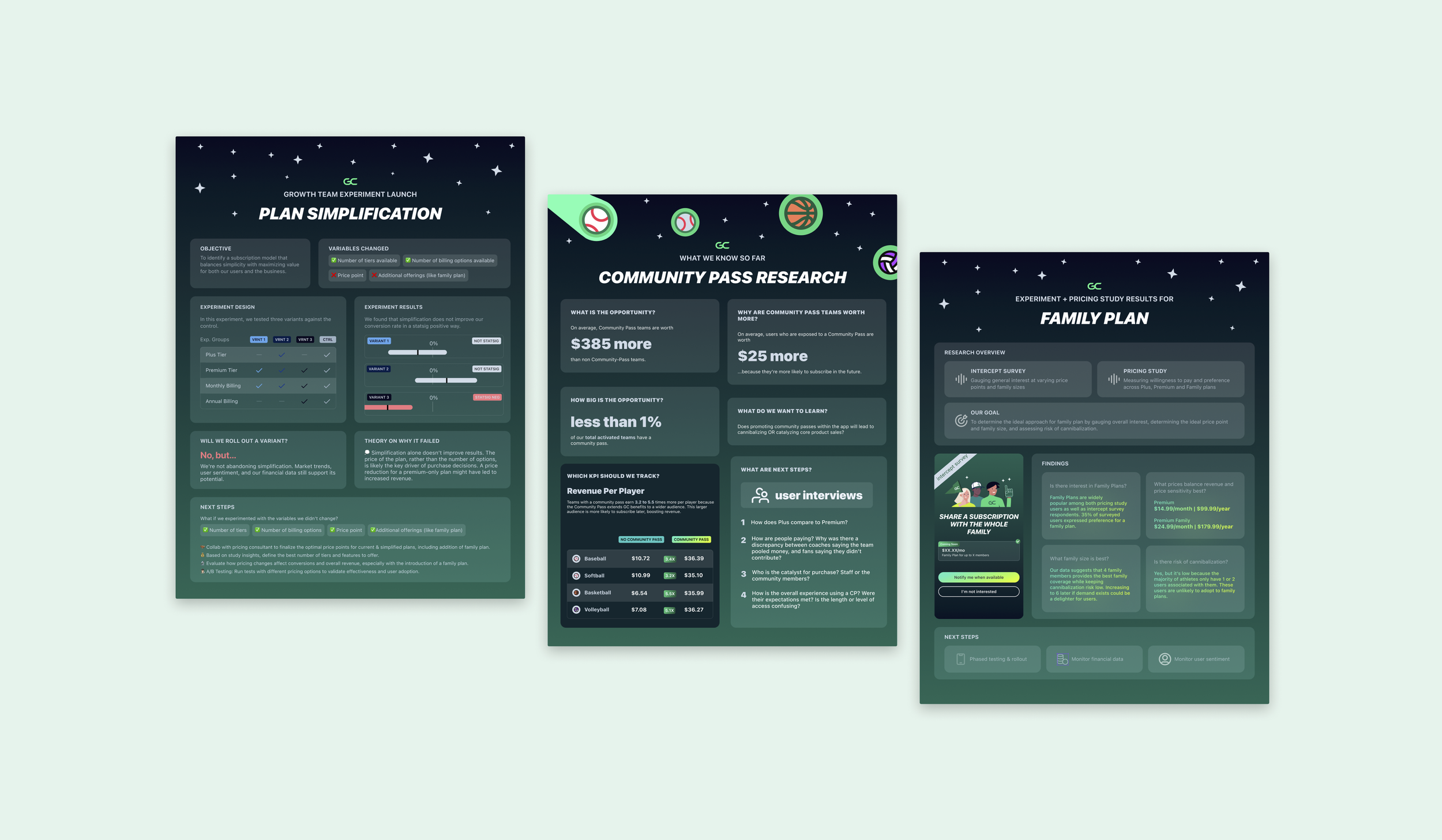
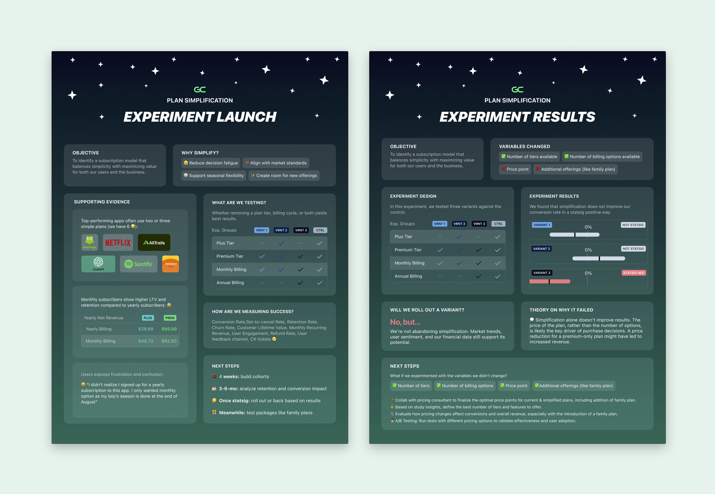
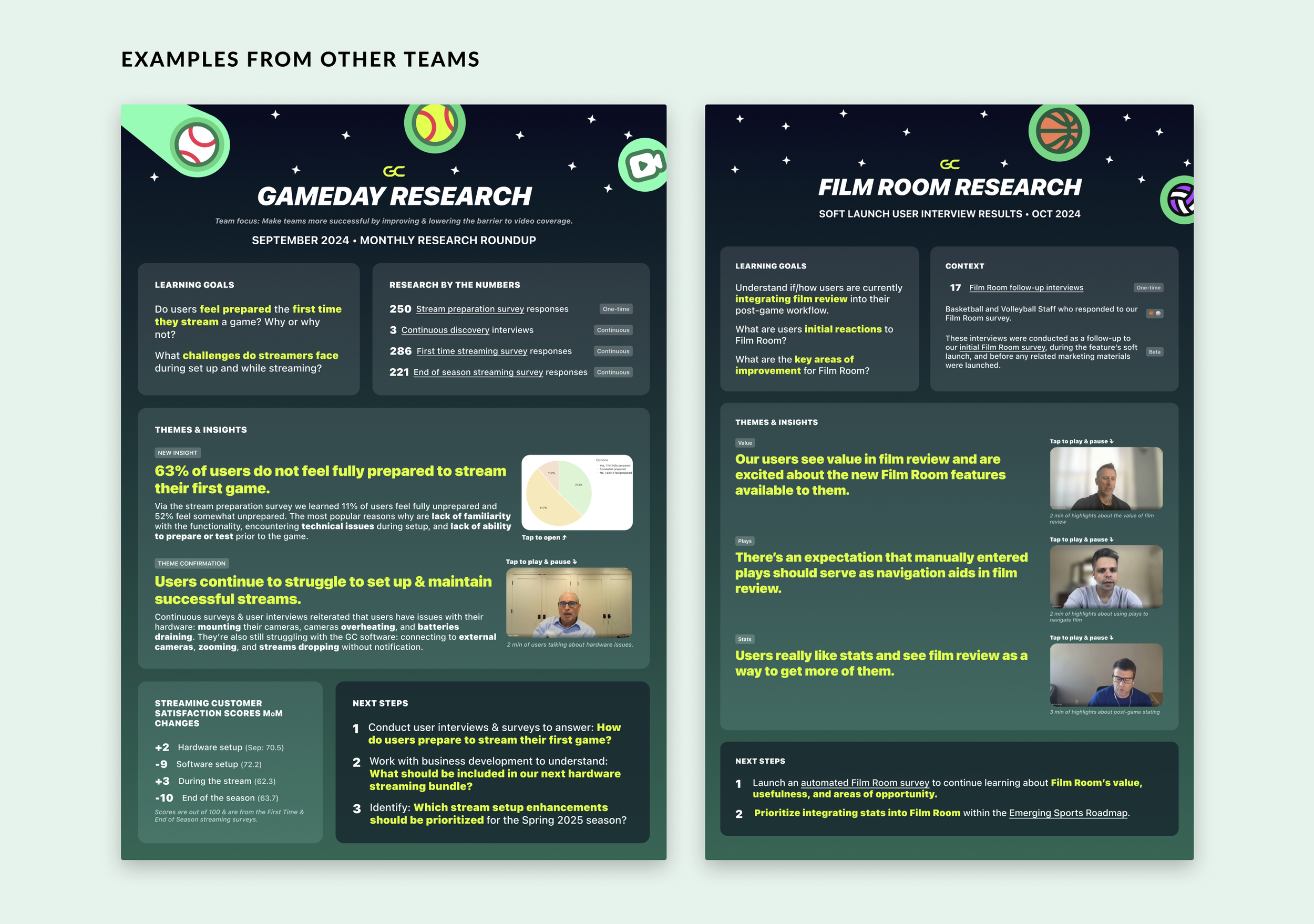
Format in Action
Each recap follows a similar flow:
1. What we’re exploring: Clear objective or opportunity statement
2. What we heard: User insight, data point, or quote that sparked the work
3. What we did: What we launched or changed (often paired with screenshots)
4. What we learned: Results from the test or research, shared plainly with a recommendation
5. What’s next: A tight summary of what we’re doing with the outcome
These stories flex to fit research synthesis, pre-launch context setting, or post-launch results. The visual structure stays consistent, but the content adapts to the moment.
The Impact
More eyes on the work. Stakeholders actually opened, read, and shared these internally.
Tighter alignment. PMs and execs quickly understood the problem and our response.
Higher reuse. The format caught on—other teams started using it for their own initiatives.
Faster decision-making. We weren’t stuck re-explaining context. It was already packaged.
“As someone who is having a hard time keeping up with all the launches... i love this! 👏🏾”
Why It Matters
We often treat internal updates like an afterthought. But I’ve found that how you present an insight often determines whether it’s acted on. These one-pagers weren’t just artifacts—they were tools. They helped move work forward.
This approach is now part of how I work. Whether I’m launching an experiment, synthesizing interviews, or planning a roadmap, I always ask: how can I make this easier to absorb?
Because if you want your work to matter, people have to read it first.